
HARMONIA
HARMONIA
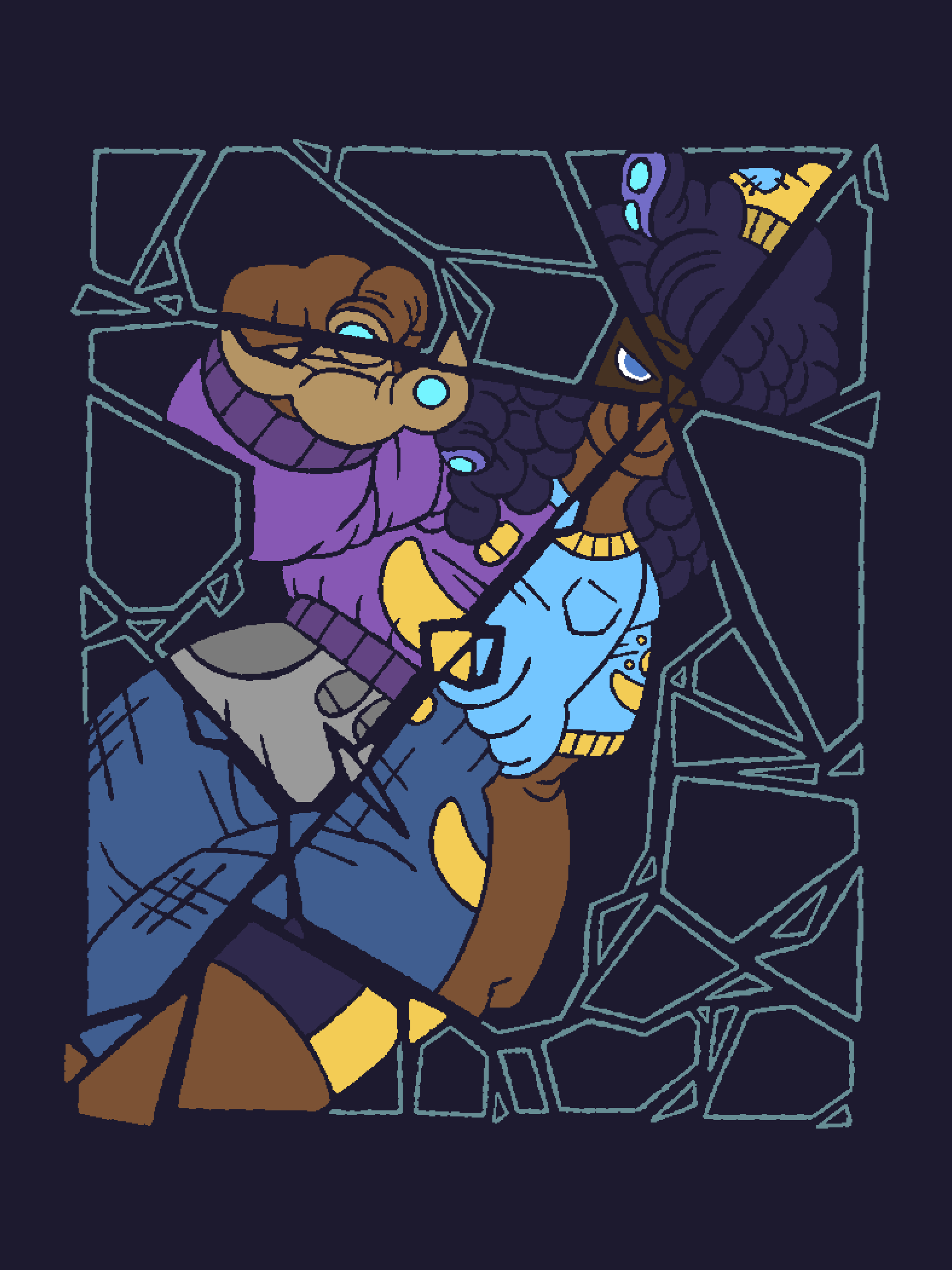
HARMONIA is a piece in which I experimented with the idea of a radial layout, being the idea that the elements of a composition lead to a center point whoch in turn radiates outwards.
The intention of this piece was that of a fictional fashion brand, “Harmonia”, meaning harmony. The idea behind this brand is that despite different backgrounds, views, and even aesthetics, the world of fashion is one that can bring us together.
The broken glass shatters at the face of the figure, with shards reflecting different parts of the body, represented in different outfits, yet all composing a full figure.
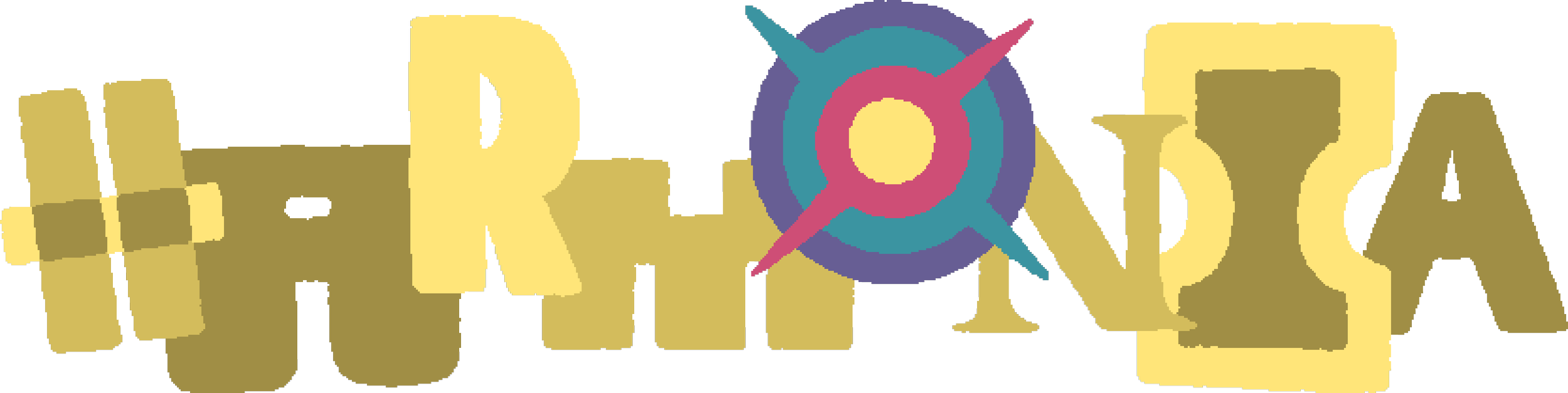
I later designed a logo for the Harmonia brand, using the idea of varying aesthetics without seeming too overwhelming or out of place. Each letter utilizes a different illustrated typeface, using the same monotone yellow cream color. The “O” is represented as a vortex, a tear in reality, something that, in a sense, brings people together from different worlds and backgrounds.